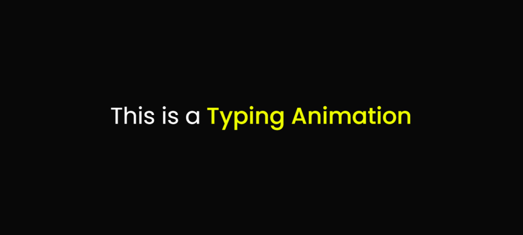
In this Blog, We Will Be Creating a Typing Animation Using HTML & CSS. This Typing Animation Slide Multiple Text In the Following Div. And This is Going Be a Interesting CSS Project And It Will Be Very Easy to Create for a Beginner.
We Will Creating This Typing Animation With 60 Lines Of CSS Only, And Text Sliding Or Typing Animations Are Mostly Seen On Personal Portfolio Sites, Business Sites And Many Other Sites.
This is Going To be My First Ever CSS Animation Post on This Website, And More CSS Animation, JavaScript Projects , Projects Using HTML, CSS Coming, Stay Tuned.
And This Is How Your Typing Animation Project Will Look Like After Writing the HTML & CSS Code:

Also Read:
• Create Facebook Post Clone Using HTML, CSS & JavaScript
• To-Do List HTML,CSS & JavaScript
• Glassmorphism Login Form Using HTML & CSS
You can Also Read The Above Posts to Create Awesome Projects & Programs, First Of Have To Create a Folder & Then Create a index.html File & style.css File To Proceed With the Project. Download Copy The Source to Create the Project.
[SOURCE CODE OF THE PROJECT]
HTML CODE Of the Project:
<!DOCTYPE html>
<html lang="en">
<head>
  <meta charset="UTF-8">
  <title>Typing Animation Using HTML & CSS </title>
  <link rel="stylesheet" href="style.css">
</head>
<body>
  <div class="wrapper">
    <div class="static-txt">This is a </div>
    <ul class="dynamic-txts">
      <li><span>Typing Animation</span></li>
      <li><span>Made</span></li>
      <li><span>Using</span></li>
      <li><span>HTML & CSS</span></li>
    </ul>
  </div>
</body>
</html>
CSS CODE Of the Project:
@import url('https://fonts.googleapis.com/css2?family=Poppins:wght@200;300;400;500;600;700&display=swap');
*{
  margin: 0;
  padding: 0;
  box-sizing: border-box;
  font-family: 'Poppins', sans-serif;
}
body{
  display: flex;
  align-items: center;
  justify-content: center;
  min-height: 100vh;
  background: #080808;
}
.wrapper{
  display: flex;
}
.wrapper .static-txt{
  color: #fff;
  font-size: 60px;
  font-weight: 400;
}
.wrapper .dynamic-txts{
  margin-left: 15px;
  height: 90px;
  line-height: 90px;
  overflow: hidden;
}
.dynamic-txts li{
  list-style: none;
  color: #eeff00;
  font-size: 60px;
  font-weight: 500;
  position: relative;
  top: 0;
  animation: slide 12s steps(4) infinite;
}
@keyframes slide {
  100%{
    top: -360px;
  }
}
.dynamic-txts li span{
  position: relative;
  margin: 5px 0;
  line-height: 90px;
}
.dynamic-txts li span::after{
  content: "";
  position: absolute;
  left: 0;
  height: 100%;
  width: 100%;
  background: #080808;
  border-left: 2px solid #eeff00;
  animation: typing 3s steps(10) infinite;
}
@keyframes typing {
  40%, 60%{
    left: calc(100% + 30px);
  }
  100%{
    left: 0;
  }
}
This Was it For this Blog See you in the Next One Till Then Keep Coding Keep Exploring!
If Like My Work Then Buy Me a Coffee
- 5 AI Tools That Replace Stack Overflow (2026 Guide for Developers) - April 2, 2026
- I Tried ChromeOS Flex After Switching From Windows 10 - October 13, 2025
- Top 5 Business Skills Every Programmer Needs to Get Hired (2025 Guide) - August 27, 2025


Pingback: Email Automation Using Python - Mr Programmer
Pingback: Realtime Chat Application Socket.io - Mr Programmer
Pingback: Password Validation Using JavaScript - Mr Programmer